Responsive and Mobile-First Design: Enhancing User Engagement in Web Development
In today’s digital age, a significant portion of internet traffic comes from mobile devices. As a result, businesses must ensure their websites are accessible and user-friendly across all devices. Responsive design and mobile-first design are two critical approaches in web development that address this need. This article explores the importance of these design strategies, their benefits, and best practices to implement them effectively.
Understanding Responsive Design and Mobile-First Design
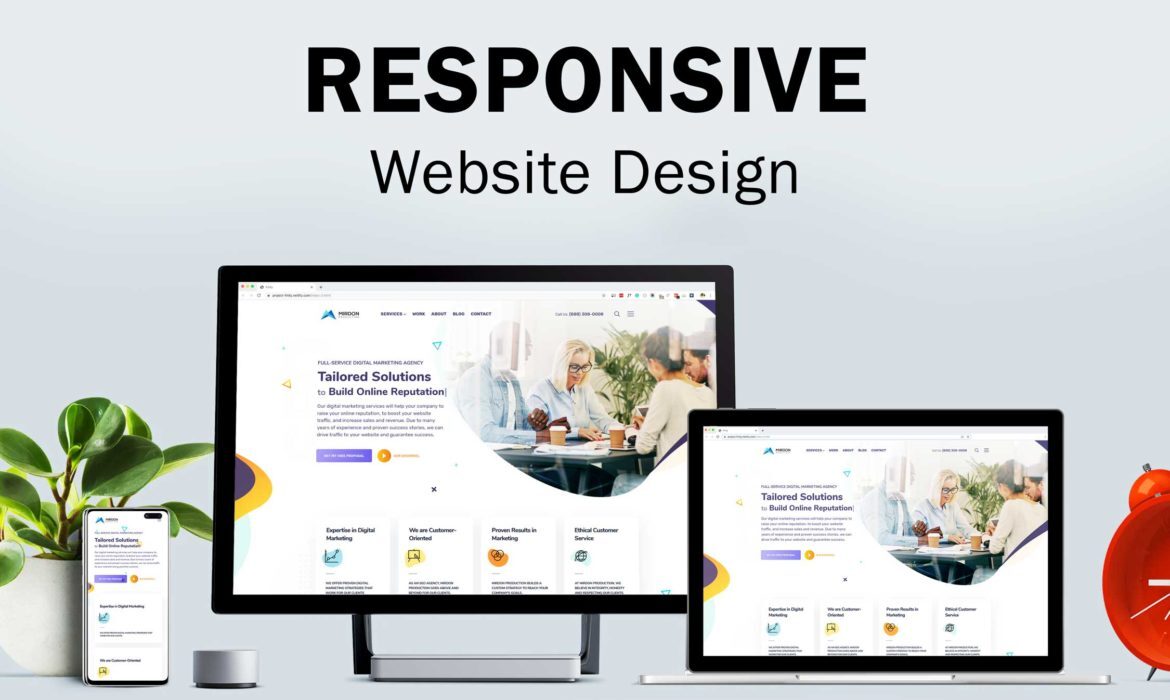
Responsive design ensures that a website adapts seamlessly to various screen sizes and devices, providing an optimal viewing experience. This approach uses flexible grids, layouts, images, and CSS media queries to adjust the website’s appearance and functionality.
Mobile-first design, on the other hand, prioritizes designing for mobile devices before scaling up to larger screens. This strategy ensures that the core user experience is tailored for smaller screens, which are often more challenging to design for due to space constraints.
Importance of Responsive and Mobile-First Design
- Improved User Experience (UX):
• Ensures a consistent and user-friendly experience across all devices.
• Reduces the need for users to zoom or scroll excessively, enhancing usability. - Higher Search Engine Rankings:
• Google and other search engines prioritize mobile-friendly websites in their search results.
• Implementing responsive and mobile-first design can improve SEO and increase organic traffic. - Increased User Engagement and Retention:
• A seamless mobile experience reduces bounce rates and encourages users to spend more time on the site.
• Higher engagement levels lead to better retention and conversion rates. - Future-Proofing:
• With the continuous growth of mobile internet usage, having a mobile-first approach ensures your website remains relevant and accessible.
• Responsive design adapts to new devices and screen sizes, protecting your site from becoming outdated.

Best Practices for Responsive and Mobile-First Design
- Prioritize Content:
• Focus on delivering essential content and functionalities for mobile users first.
• Use a content hierarchy to ensure that the most important information is easily accessible. - Flexible Grids and Layouts:
• Use a flexible grid system that adjusts based on the screen size.
• Implement fluid layouts that resize elements proportionally, ensuring a consistent look. - Optimized Images and Media:
• Use responsive images that adjust to different screen resolutions.
• Optimize media files to reduce load times, especially on mobile networks. - CSS Media Queries:
• Employ CSS media queries to apply different styles based on the device characteristics.
• Create breakpoints for various screen sizes to ensure a smooth transition between layouts. - Touch-Friendly Navigation:
• Design navigation elements that are easy to use on touchscreens.
• Ensure buttons and links are appropriately sized and spaced to prevent accidental clicks. - Performance Optimization:
• Minimize the use of heavy scripts and large files that can slow down the site.
• Use caching and content delivery networks (CDNs) to improve load times. - Testing Across Devices:
• Regularly test your website on various devices and screen sizes to ensure consistent performance.
• Use tools like Google’s Mobile-Friendly Test and BrowserStack for comprehensive testing.
Real-World Examples
- E-commerce Websites:
• Responsive and mobile-first design can significantly enhance the shopping experience, leading to higher conversion rates.
• For example, Amazon’s mobile-first approach ensures that users can easily browse, search, and purchase products on any device. - News and Media Sites:
• These sites often see high traffic from mobile users. Implementing a mobile-first design ensures that content is easily readable and accessible.
• The New York Times uses responsive design to deliver a consistent reading experience across all devices.
Responsive design and mobile-first design are no longer optional but essential strategies in web development. By prioritizing these approaches, businesses can enhance user engagement, improve search engine rankings, and future-proof their websites. Implementing these best practices ensures that your website provides a seamless and enjoyable experience for all users, regardless of the device they use.