The Impact of Mobile-First Design on Web Development
The benefits of Mobile-First Design are numerous. By designing for the smallest screen size first, developers can focus on creating a streamlined, user-friendly experience for mobile users. This can help to increase user engagement and improve user retention. Additionally, Mobile-First Design can help to reduce development time and costs, as developers do not have to spend time and resources adapting the website for different devices.
In addition to the benefits for users, Mobile-First Design also has benefits for businesses. By optimizing their websites for mobile devices, businesses can reach a wider audience, as more and more people are accessing the internet through mobile devices. Additionally, businesses can improve their search engine rankings, as search engines prioritize websites that are optimized for mobile devices.
Responsive Web Design and Its Role in Mobile Development
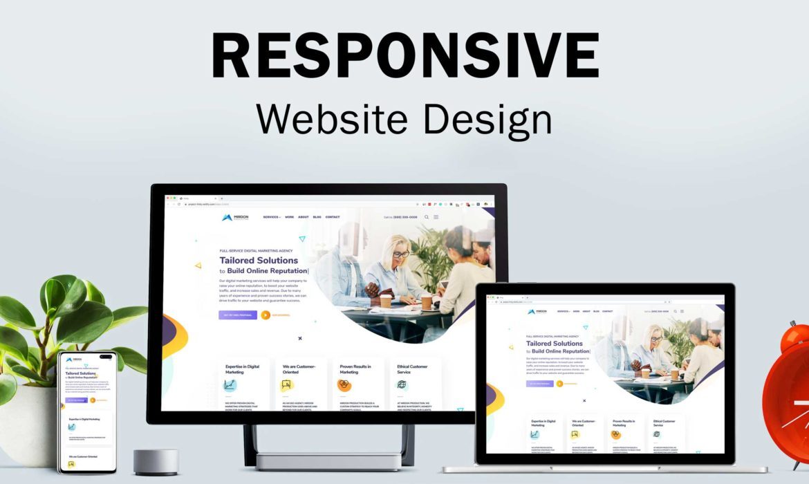
Responsive Web Design is an important part of modern web development. It is a design approach that allows web pages to adapt to the size of the user’s device or browser, providing an optimal viewing experience on all devices, from desktop computers to mobile phones.
Responsive web design is based on the idea of creating a single website that can be accessed from any device, regardless of the size of the screen. is achieved by using flexible and layouts, images, intelligent use of CSS media queries.
Responsive web design has become increasingly important in recent years, as the number of people using mobile devices to access the web has grown exponentially. Mobile devices are now the most common way people access the internet, and websites must be optimized for these devices.
Responsive web design has several advantages. It ensures that websites are optimized for all devices, which can improve user experience, increase engagement, and boost conversions. It also makes it easier for developers to create and maintain a single website, rather than having to create separate versions for different devices.
Responsive web design also helps to improve search engine rankings. Search engines prefer websites that are optimized for all devices, as this makes them easier to crawl and index. This can lead to improved visibility and higher rankings in search results.
The Benefits of Progressive Web Apps for Web Development
Progressive Web Apps (PWAs) are a new type of web application that combines the best of both the web and mobile worlds. They are designed to provide a fast, reliable, and engaging user experience on any device, including mobile devices. PWAs are built using modern web technologies such as HTML, CSS, and JavaScript.
PWAs offer a number of advantages for web development. First, they are more reliable than traditional web applications. PWAs are designed to work offline and can be cached on the user’s device, ensuring that the user can access the application even when they are not connected to the internet. This makes PWAs more reliable than traditional web applications, which require an internet connection to work.
Second, PWAs are more secure than traditional web applications. PWAs are served over HTTPS, which ensures that the data being sent between the user’s device and the server is encrypted. This makes it much more difficult for malicious actors to intercept and steal data.
Third, PWAs are faster than traditional web applications. PWAs are designed to load quickly and respond quickly to user input. This makes them much more enjoyable to use than traditional web applications, which can be slow and unresponsive. Finally, PWAs are more engaging than traditional web applications. PWAs can be designed to provide a more immersive and interactive experience than traditional web applications. For example, PWAs can be designed to send push notifications.
Leveraging Mobile-Specific Technologies for Web Development
Web Development is the process of creating websites and web applications for the Internet. It involves coding, designing, and deploying web applications to the World Wide Web. In recent years, mobile devices have become increasingly popular, and as a result, mobile-specific technologies have become essential for web development.
Mobile-specific technologies are tools and techniques that are designed to optimize websites and web applications for mobile devices. These technologies allow developers to create web applications that are tailored to the needs of mobile users. This includes features such as responsive design, which enables websites to automatically adjust their layout and content to fit the size of the device’s screen.
Another important mobile-specific technology is Progressive Web Apps (PWAs). PWAs are web applications that are designed to look and feel like native mobile apps. They are built using web technologies such as HTML, CSS, and JavaScript, and can be installed directly from the web browser. PWAs offer a number of advantages over native apps, including faster loading times, better performance and increased engagement.
In addition to PW, there are also other mobile-specific that can be used in web development. These included Mobile Pages (AMP which is designed to make pages load faster on mobile devices, and MobileFirst Indexing, which ensures that websites are optimized for mobile devices before they are indexed by search engines.
The Growing Role of Mobile-Centric Frameworks in Web Development
Web development has become increasingly important in the digital age. With the proliferation of mobile devices, the need to create websites and applications that are optimized for these devices has become essential for businesses to remain competitive. Mobile-centric frameworks have emerged as an important tool for web developers to create mobile-friendly websites and applications.
Mobile-centric frameworks are designed to make it easier for web developers to create websites and applications that are optimized for mobile devices. These frameworks provide a set of tools and libraries that allow developers to quickly and easily create mobile-friendly websites and applications. These frameworks also provide developers with the ability to create websites and applications that are optimized for different types of mobile devices.
Mobile-centric frameworks also provide developers with the ability to create websites and applications that are optimized for different types of mobile devices. This means that developers can create websites and applications that are optimized for different types of devices, such as smartphones, tablets, and wearables. This allows developers to create websites and applications that are optimized for different types of users, such as those who are using a smartphone, tablet, or wearable device.
Mobile-centric frameworks also provide developers with the ability to create websites and applications that are optimized for different types of mobile networks. This means that developers can create websites and applications that are optimized for different types of mobile networks, such as 4G, 5G, and Wi-Fi. This allows developers to create websites and applications that are
In conclusion, mobile devices are revolutionizing web development by providing users with a more convenient, streamlined, and personalized experience. Mobile devices have enabled developers to create more engaging and interactive websites, as well as to optimize websites for better performance and faster loading times. Furthermore, mobile devices have opened up a world of possibilities for developers, allowing them to create more innovative and creative web applications. With the continued growth of mobile devices, web development is sure to continue to evolve and expand in the coming years.


