## The Email Minefield: Why “It Works in My Browser” Isn’t Good Enough
You’ve just finished designing a beautiful, on-brand email. The colours are perfect, the copy is sharp, and the call-to-action button is impossible to miss. You hit send, and then the reports start trickling in. On your colleague’s Outlook, the layout is smashed to the left. On a Samsung Galaxy, the text is tiny and unclickable. On Gmail, your carefully chosen web font has reverted to a generic Arial.
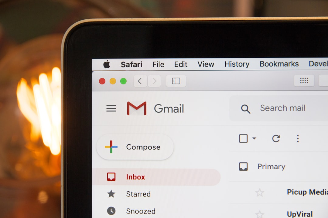
*Photo by [Stephen Phillips – Hostreviews.co.uk](https://unsplash.com/@hostreviews?utm_source=ai_auto_content_saas&utm_medium=referral) on [Unsplash](https://unsplash.com/photos/black-laptop-computer-3Mhgvrk4tjM?utm_source=ai_auto_content_saas&utm_medium=referral)*
This is the daily reality of email development. Unlike web development, where you are primarily coding for a handful of modern browsers, email development requires you to code for dozens of unique email clients, each with its own quirks and rendering engine. At **Extra Web Solutions**, we’ve navigated these treacherous waters for clients ranging from hospitality giants to e-commerce startups. We know that a broken email isn’t just an IT issue; it’s a direct hit to your brand reputation and conversion rate.
In this guide, we’ll break down the ins and outs of professional email template development, helping you avoid the common pitfalls that sink campaigns and ensuring your messages render beautifully and drive engagement everywhere.
## The Foundation: Coding for the Wild West of Email Clients
Web developers have the luxury of using CSS Grid, Flexbox, and modern JavaScript. Email developers do not. The landscape is fragmented, dominated by three major players: **Apple Mail (with its native client), Gmail (which now uses a stricter rendering engine), and Microsoft Outlook (which still uses the antiquated Word HTML engine).** This means your code must be bulletproof and backwards-compatible.
Here is the golden rule of email development: **Keep it simple and use tables for layout.** While it feels archaic, using nested “ elements with `role=”presentation”` is the only guaranteed way to ensure a consistent layout across all clients.
– **Use Inline Styles:** CSS placed in the “ of your email is often stripped out by clients like Gmail. You must use inline styles on every element to ensure your design holds up.
– **Don’t Rely on JavaScript:** Most email clients block JavaScript for security reasons. Your email must be fully functional without it.
– **Be Wary of CSS Support:** Properties like `position`, `float`, and `margin: auto` are inconsistently supported. Stick to simple `padding`, `text-align`, and `border` attributes.
– **Bulletproof Buttons:** Instead of using a styled `` tag that can be stripped of its styling, use a table cell with a background colour and a link inside. This ensures your CTA is always clickable and visually intact.
## Responsive Design: More Than Just Shrinking the Image
**Responsive email design** isn’t just about making an image smaller; it’s about restructuring the entire user experience for a mobile screen. Over 60% of emails are opened on a mobile device first. If your email is a 600px-wide desktop design squeezed down to 320px, you are forcing your subscribers to pinch and zoom—a surefire way to kill engagement.
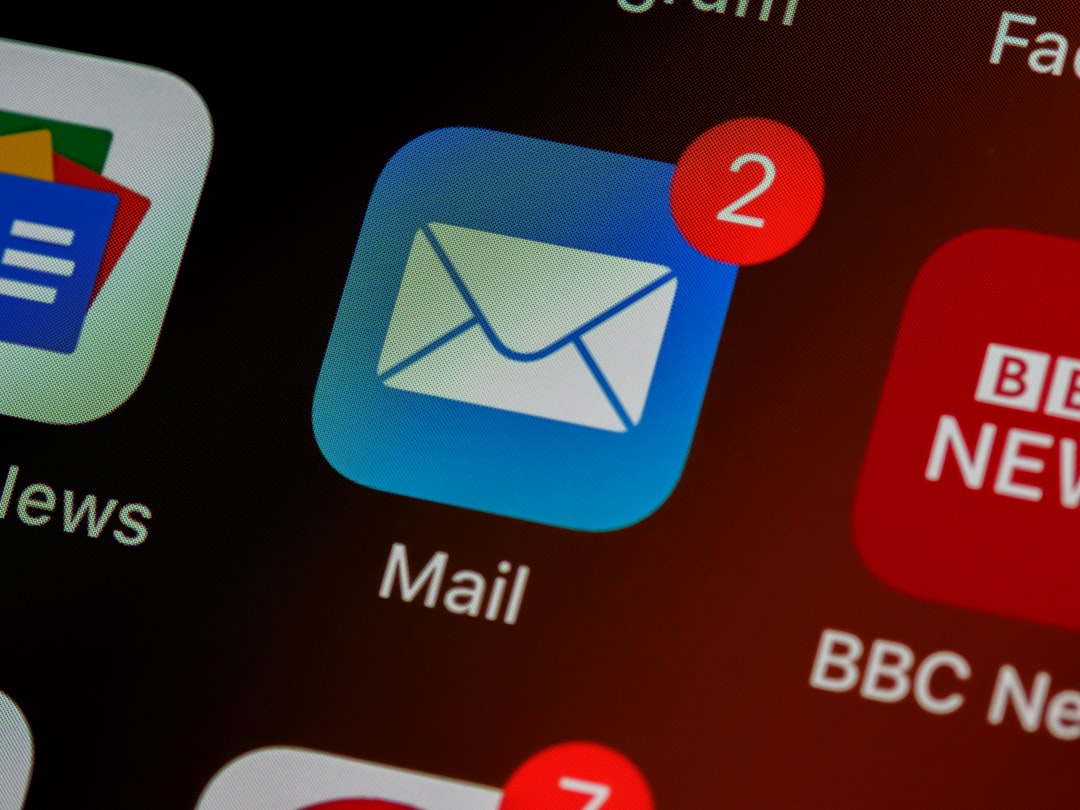
*Photo by [Brett Jordan](https://unsplash.com/@brett_jordan?utm_source=ai_auto_content_saas&utm_medium=referral) on [Unsplash](https://unsplash.com/photos/closeup-of-mail-app-icon-on-phone-LPZy4da9aRo?utm_source=ai_auto_content_saas&utm_medium=referral)*
To master this, you need to implement a **mobile-first or mobile-aware strategy**.
– **Media Queries (With a Fallback):** Use `@media` queries to target screen widths below 480px. In these queries, you can set your email container to `width: 100%`, stack your columns (by setting `display: block` on table cells), and increase font sizes to at least 14px for readability.
– **Fluid Hybrid Design:** This is the “spongy” technique. Instead of fixed pixel widths, use `max-width` on your container. In the HTML, set the table width to 100% and use a `max-width` of 600px. This allows the email to shrink naturally on smaller screens without relying solely on media queries (which Outlook doesn’t support).
– **Touch-Friendly Targets:** Ensure your buttons and links are at least 44×44 pixels to accommodate a thumb tap. Don’t put links too close together.
– **Scalable Images:** Use `height: auto` and `width: 100%` on your images within fluid containers so they scale down proportionally to the screen size.
## The Preheader and Accessibility: The Unsung Heroes
A technically perfect layout is useless if the content is inaccessible. **Digital design in email is about inclusivity.**
– **The Preheader Text:** This is the snippet of text that appears after the subject line in the inbox. If you don’t define it, clients will pull random, messy text from your email. Use a hidden “ at the top of your email to set a clear, enticing preheader that complements your subject line.
– **Semantic Elements:** Use the `
` to `` tags for headings. While you must style them inline, using the semantic tag helps screen readers navigate the content structure.
– **Alt Text is Non-Negotiable:** Many users have images disabled by default. Your `alt` text should describe the image’s purpose or convey the same message as the image. For your logo, use the company name; for a product photo, use the product name and colour.
– **Contrast and Fonts:** Ensure your text colour contrasts sufficiently with your background. Avoid using light grey on white. Also, stick to standard web-safe fonts (like Arial, Georgia, Verdana) or use a fallback stack—your custom font will not render in many clients.
– **Alt Text is Non-Negotiable:** Many users have images disabled by default. Your `alt` text should describe the image’s purpose or convey the same message as the image. For your logo, use the company name; for a product photo, use the product name and colour.
– **Contrast and Fonts:** Ensure your text colour contrasts sufficiently with your background. Avoid using light grey on white. Also, stick to standard web-safe fonts (like Arial, Georgia, Verdana) or use a fallback stack—your custom font will not render in many clients.
## The Extra Web Solutions Approach to Email Development
Creating an email that “works everywhere” is a meticulous process. It’s a blend of front-end engineering and creative design. When we undertake email template development at **Extra Web Solutions**, we don’t just code a template; we build a system. We consider how the template integrates with your CRM, how it aligns with your SEO strategy (yes, email links count!), and how it supports your overall digital marketing goals.
We understand the pain of dealing with generic, off-the-shelf templates that look like a 2010 spam message. Our process involves:
1. **Designing for the Brand:** We create visuals that match your website’s UX design, ensuring a seamless transition from inbox to landing page.
2. **Rigorous Testing:** We test every template across a matrix of devices and clients (Outlook, Gmail, Apple Mail, Outlook for Mac, and various mobile clients) before it ever goes live.
3. **Modular Development:** We build using modular blocks (headers, content, products, footers) so you can easily swap out content in your ESP without breaking the code.
We take the headache out of digital transformation. Whether you need a bespoke email series for a product launch or a fully automated CRM integration, we build the technical foundation so you can focus on the message. If you’re currently wrestling with a campaign that looks broken on your stakeholders’ phones, it’s time to upgrade your approach.
## From Broken to Brilliant
Mastering email development is about respecting the limitations of the medium while pushing the boundaries of what’s possible. It’s about ensuring that the time you spend crafting a message isn’t wasted on a rendering error.
By following these principles—**coding for Outlook, utilising fluid design, and prioritising accessibility**—you can create emails that not only look professional but also perform. A well-crafted, responsive email respects your audience’s time and device, which in turn builds trust and drives the clicks that matter.
Remember, your email is a reflection of your business. If it looks broken, your product looks broken. Don’t let a poor technical foundation sabotage your message. For more insights on how to boost your engagement, check out our recent article on [Email Marketing Best Practices](https://extrawebsolutions.co.uk/news-and-articles/email-marketing-best-practices-how-to-boost-engagement-and-conversions/). And if you need a partner to handle the heavy lifting of code and integration, **[get in touch with our team today](https://extrawebsolutions.co.uk/contact/)**. We’re here to make your digital marketing headache-free.